1. the idea
pluto lives inside someone else's game. Minecraft is the picture and pluto is a thin layer over it, so almost every choice comes from staying out of the way: dark, flat and quiet, and only loud when something actually matters.
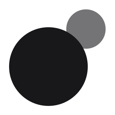
it's a small planet with a moon, far out where it's dark. that's where the mark comes from, the planet horizon the site stands on, and why everything is near black with a little light on it.
2. the mark
a planet and its moon: two circles in a 38 unit box. the moon is half the planet (6.5 against 13) and tucks just behind it. no ring, no outline, no gap, no shadow.
keep a moon's width (13 units) clear all round it. the smallest it goes is 16 px, the favicon. it's white on dark and #18181b on light, and next to the wordmark it sits at the height of the letters.
the name is always pluto, lowercase, even at the start of a sentence. download the mark in white or dark.

3. colour
nearly everything is near black, and white is the only accent. colour shows up only when it means something, so when it does, it gets noticed. red means bad, or something you can't take back, and nothing else.
4. type
geologica, for everything. it's round and a little soft, and it stays readable at the small sizes the hud uses. regular for text, medium for names and numbers, semibold and bold for headlines.
pluto's own words are lowercase, headlines too; other people's names keep their capitals (Minecraft, Java Edition). headlines are bold, set tight (-0.045em) and end with a period, like a sentence. on the hud: 12 for text, 10.5 for small print, 22 for big numbers.
5. surfaces
everything is a card floating over something, the game or the planet. a card is near black with a hairline edge and a soft shadow, and cards keep their distance from each other instead of being split by lines.
on the hud a card is 12 round, in the menu 16, on the site rounded-2xl. and every card also works without one: bare text over the game, which turns dark over anything bright so it stays readable.
6. icons
lucide: a 24 grid, a 2 px stroke, round ends. in quiet grey unless the icon is the point.
7. motion
things move like they have a little weight: springs that settle without overshooting, in about a third of a second. things come in by fading up as they grow from 94%, and leave a bit quicker. numbers roll, pages blur into each other, and nothing bounces or slides in from off screen.
8. writing
short and plain, like talking to a friend. say what someone needs and stop; if it's obvious, leave it out. a module gets one line, and it's allowed to be a joke:
- fullbright · torches are a skill issue.
- zoom · the spyglass has never been more portable.
- clock · for when one more game turns into 4am.
- now playing · displays the absolute jammers you're listening to.